
I have only ever used latex/acrylic paint and chalk paint to paint furniture. I have greatly enjoyed using chalk paint on furniture pieces for the simple fact that there is no sanding required. I have always wanted to try Miss Mustard Seed's Milk Paint because I really like the chippy/distressed look and I really like her colors. I had a friend give me some Real Milk Paint to try and I painted a few little pieces, but I really didn't understand what to expect. I read up on MMS Milk Paint and watched her videos to learn more about milk paint. I finally decided to try out MMS Milk Paint.
I chose the color Kitchen Scale.
I believe the color was named after a kitchen scale that
Miss Mustard Seed owned.
Here is my adventure with MMS Milk Paint:

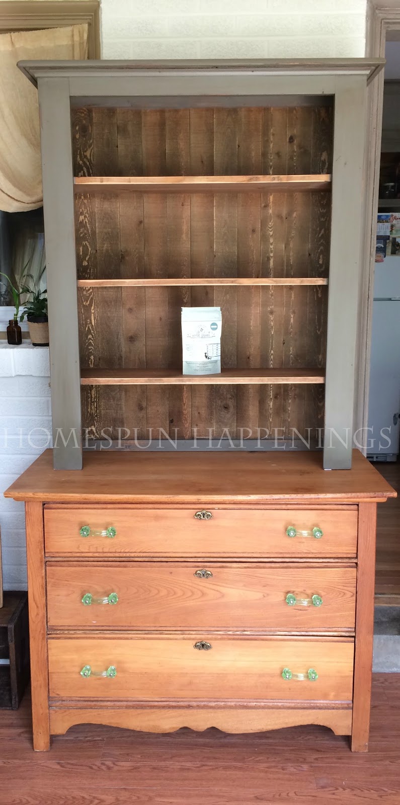
It all started with this. A mixture of a hutch top and dresser. I wanted to paint them the same color to blend the pieces together. I was concerned that the milk paint would chip on the hutch and the green/gray would show through especially since it had two layers of Hunters gray and the original red color that I bought it as. Plus I had a coat of stain over the gray. I didn't think the green/gray would look good through this Kitchen Scale color and I thought it would not blend the two pieces together with the natural wood work chipping through on the dresser.
I did hand sand the gray paint with a piece of sand paper--not sure if that is what helped the milk paint to grab and stain into the wood or if it was just because the hutch itself is pine and pine seems to absorb a lot.
I followed the directions carefully almost, but on the first coat of the hutch I forgot to let the paint set for at least 10 minutes to let the paint dissolve and the pigments to come together. I did notice some yellow streaks because I did not let it dissolve. For the rest of the coats, I did let it set.

I was a little disappointed that the hutch didn't chip at all. I ended up distressing it with sand paper and dark wax.

I also purchased Hemp Oil to try on the plain wood. I sanded the top of the dresser and applied the oil. The wood was a little too light in color for me, so I did mix it with some dark wax. It tinted it a little, but I am not sure if the wax really took. The Hemp Oil may have resisted most of it, because when I buffed the top, a lot of dark wax was on my rag.

I really wanted that deep green-blue look that I saw in pictures of other pieces painted in Kitchen Scale. The paint honestly reminded me a little of Annie Sloan Duck Egg, but when I applied the clear wax, that deep tone popped!

The dresser on the other hand chipped like crazy and I love it! They both reacted the way I had hoped. Having the top being more solid and not showing the green/gray color helps them blend as one piece that
"aged over the years"
I really like dark wax on pieces.
I like the distressed look on furniture. It makes me relax :)
To me a piece doesn't feel finished without the antiqued look...just my opinion.
Here it is before I buffed wax.

Here they are together!
I am not sure why the top of the picture is tinted yellow.
It is probably the way the sun was coming in the room

No comments:
Post a Comment
Thank you for your thoughts! I really enjoy hearing from my readers. If you ask a question, I will try to reply A.S.A.P.